The Sardine Can
The other day, I riffled through my old Saveur magazines to find inspiration for dinner. A recipe for spaghetti with sardines caught my stomach’s eye. I was in a southern Italian mood, having been lately indulging in reveries about our 2000 trip to Puglia Portugal

First, the lettering. It is much bigger on theU.S. U.S.
Then the color, a relatively bland red, topped off by a truly hideous shade of blue-green (acqua?) in the word “SARDINES.” Navy blue for the brand name. So we have the seafaring references covered. All this against a dull, dirty shade of off-white or gray, I can’t really tell. Maybe like an overcast sky? (“None of them knew the color of the sky...", for you literary types.)
I could not help but wonder why the front of the can had to have the jingoist label “Proudly Made in theUSA
Lastly, there is an awful lot of information packed onto the front. Bar code, ingredients, weight info, web site.
All in all, a perfunctory buy for me. There is no brand promise other than it serves a patriotic duty, really. And – a real no-no in today’s health conscious consumer’s mind – you are instructed to WRITE for nutrition information to an address that is given!!!! You are not even directed to a web site. Isn’t this illegal? More:

The side and backside are devoid of any graphic element, although there is some ribbing in the middle of the sides that feels good when I grasp the tin between thumb and fingers and give it a rub.
The key opener is smack in the middle of the front, off to the side, looking lethal as ever.
Net weight: 3.75 OZ or 106g.
Ingredients: besides sardines, they include garlic powder, onion powder, natural flavors (what does this mean anyway?), modified cornstarch (genetically modified?), sugar, tomato paste, xanthan gum, horseradish powder, extractives of paprika (hmm. Mysterious.) totaling 10 ingredients in all. On second thought, I don’t want to eat these. Maybe the only reason to eat these is indeed if you feel it is a patriotic duty.
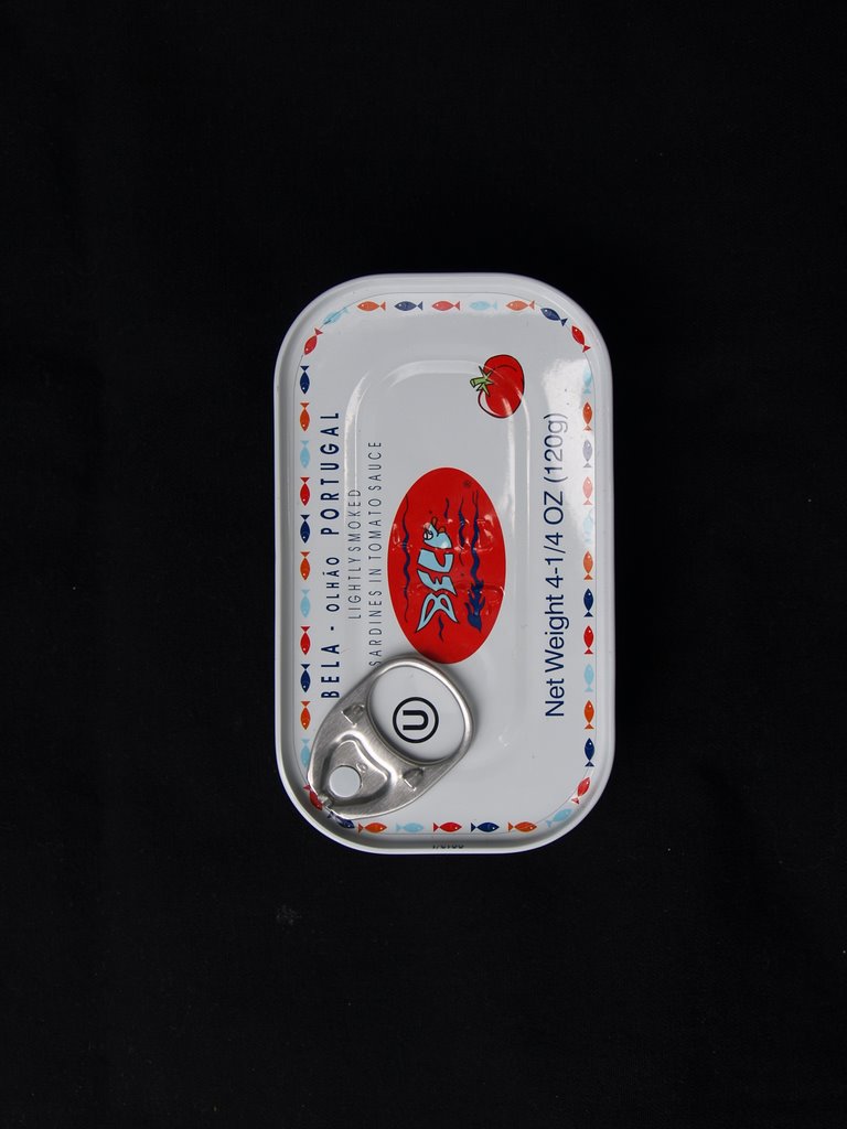
The Bela lettering is set against a glorious red. To the right side, there is a pictogram of a tomato in the same shade. I don’t know what to call the red – it has a bit of coral, a bit or orange, but it is, well, YUMMY. Again, I’m getting a message about what this brand means.
Best of all, the entire rim of the front of the can is ringed with swimming fish, in alternate shades of that Mediterranean blue, navy blue, and red. It reminds me of the way tadpoles swim in a pool. That’s fun, too.
There is a lot less information on the front, so the main impression is the childlike fun of seeing that logo and the swimming fish and that primal response to the dazzling red. Nutrition facts, bar code and other info is all on the back, in black against white punctuated by that funny logo again. Added is a small logo that lets you know the can is recyclable. So now I know I am buying something more than sardines.
The sides are entirely ribbed and covered with the swimmers, with the logo and tomato superimposed. Fun to touch and look at.
The key opener is at a natty angle, maybe helping it look a bit less lethal. Or maybe I'm just biased by now.
Net weight: 4.25 OZ or 120g. More than the what's its name brand above.
Ingredients: sardines, water, tomato puree, extra virgin olive oil, salt, natural smoke flavor, totaling a mere six in all. These sardines will go in the spaghetti.
My first conscious thought upon seeing it was, “What can do with this can after I use the sardines, in order to justify saving it?” Not far below consciousness was another thought,
“
Therein lies the power of design.
Now let’s compare Bela with a competitor from the

First, the lettering. It is much bigger on the
Then the color, a relatively bland red, topped off by a truly hideous shade of blue-green (acqua?) in the word “SARDINES.” Navy blue for the brand name. So we have the seafaring references covered. All this against a dull, dirty shade of off-white or gray, I can’t really tell. Maybe like an overcast sky? (“None of them knew the color of the sky...", for you literary types.)
I could not help but wonder why the front of the can had to have the jingoist label “Proudly Made in the
Lastly, there is an awful lot of information packed onto the front. Bar code, ingredients, weight info, web site.
All in all, a perfunctory buy for me. There is no brand promise other than it serves a patriotic duty, really. And – a real no-no in today’s health conscious consumer’s mind – you are instructed to WRITE for nutrition information to an address that is given!!!! You are not even directed to a web site. Isn’t this illegal? More:

The side and backside are devoid of any graphic element, although there is some ribbing in the middle of the sides that feels good when I grasp the tin between thumb and fingers and give it a rub.
The key opener is smack in the middle of the front, off to the side, looking lethal as ever.
Net weight: 3.75 OZ or 106g.
Ingredients: besides sardines, they include garlic powder, onion powder, natural flavors (what does this mean anyway?), modified cornstarch (genetically modified?), sugar, tomato paste, xanthan gum, horseradish powder, extractives of paprika (hmm. Mysterious.) totaling 10 ingredients in all. On second thought, I don’t want to eat these. Maybe the only reason to eat these is indeed if you feel it is a patriotic duty.
Now for Bela. Truly BELLA in my view.
The Bela lettering is set against a glorious red. To the right side, there is a pictogram of a tomato in the same shade. I don’t know what to call the red – it has a bit of coral, a bit or orange, but it is, well, YUMMY. Again, I’m getting a message about what this brand means.
Best of all, the entire rim of the front of the can is ringed with swimming fish, in alternate shades of that Mediterranean blue, navy blue, and red. It reminds me of the way tadpoles swim in a pool. That’s fun, too.
There is a lot less information on the front, so the main impression is the childlike fun of seeing that logo and the swimming fish and that primal response to the dazzling red. Nutrition facts, bar code and other info is all on the back, in black against white punctuated by that funny logo again. Added is a small logo that lets you know the can is recyclable. So now I know I am buying something more than sardines.
The sides are entirely ribbed and covered with the swimmers, with the logo and tomato superimposed. Fun to touch and look at.
The key opener is at a natty angle, maybe helping it look a bit less lethal. Or maybe I'm just biased by now.
Net weight: 4.25 OZ or 120g. More than the what's its name brand above.
Ingredients: sardines, water, tomato puree, extra virgin olive oil, salt, natural smoke flavor, totaling a mere six in all. These sardines will go in the spaghetti.
posted by KM at 2:11 PM
![]()
![]()

2 Comments:
This comment has been removed by a blog administrator.
Hey, Brian,
I wondered about that too. Notice Bela's is a slimmer, elongated shape compared to that U.S. one. (The name always escapes me.) Smoked trout comes in cans of the same shape. Must be a fish cannery tradition!
Post a Comment
<< Home